The ultimate offline experience
This project was conceived out of a desire to create an offline experience for the web that felt natural, instead of clunky or non-existent.
The end result will benefit all users by improving performance through intelligent caching and progressive enhancement techniques.
So, that sounds cool, but what does it looks like and how would it work?…
Network first
Cache essential downloaded content
An undeniable truth of the web is that the websites content isn't going to be delivered to your computer without any network connection. This is why "offline first" could be misleading terminology. If there is no connection at all on first visit then there is no choice but to fall back to the browsers default handling of the situation.
But assuming there is a connection, the page will load and after some time the user will hopefully click through to an interesting link.
While this is happening essential downloaded content should be being stored in a cache for later use.
Eventually the user returns to the original web page, on the same day or a week later looking to re-read or find other interesting content on the page…
Cache to the rescue
Content should be cache first then enhanced using the network
Another undeniable truth of the web is, users connections can't be relied upon. Inevitably, connection issues occur, either the network drops out or becomes so slow the website is unusable.
The page might look like this now…
Or this…
Even if the connection doesn't cause issues, why should the user have to re-download the content that's already been downloaded?
They shouldn't…while online, downloaded essential network requests and assets were cached depending on what the user has viewed.
The cache is reliable, the connection is not. Therefore, the content should be cache first then enhanced using the network.
Not everything is cached
Provide a visual indication of content that is unavailable or may be slow
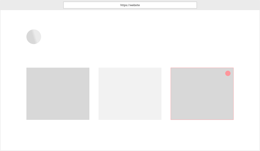
There's still a lot of content on the web page that hasn't been cached yet, if the users connection isn't good enough they'll have trouble viewing it.
Traditionally, a user would innocently click through without knowing this. Inevitably they will end up:
- Getting frustrated with the wait
- Left with either a blank page or assets, styles and text loading at different times
- Thinking other areas of the website will feature the same degraded experience
- Blaming the website for being slow and leave
The web can be better than that and so, we should go a step further.
This can be achieved by providing a visual indication of content that is unavailable or may be slow.
Getting re-connected
Content seamlessly becomes available
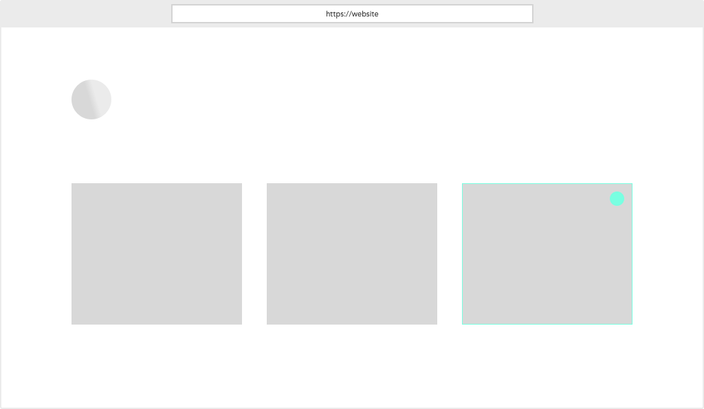
The cache is still used to improve performance but once a network connection is regained the website is no longer completely reliant on the cache.
Just as visual indicators were used to warn users about issues with content loading they should now be used to inform them that the same content is now safe to view.
This might happen while the user is viewing the page or after they return to it.
Do it!
Won't this be hard? I hear you, that's why this exists, it's a deep dive on subjects surrounding progressive enhancement techniques and the offline web experience.
The best techniques will be uncovered and a lot of them won't be as difficult as you might think to implement.
So if you're interested in building better web experiences, let's get started!
Next up: Offline fundamentals ⟶